SCROLL to see all work in this section.
Strategy, UX, Visual Design, Illustration
Credits:
Mark Ray - ECD
Rob Miller - Writer
Going solar can be a significant investment for homeowners. The "Welcome to Solar" campaign invited prospects to explore how solar power works, the benefits of SunPower solar, financing options, and more.
Approach
Working as part of SunPower's internal brand team, I served as a point of contact with their marketing team—consulting on brand strategy and visual communications while leading creative execution across multiple projects. For this campaign, the microsite grew with the email cadence: new landing pages were added as each email went out, guiding prospects deeper into the solar journey. Custom illustrations brought technical concepts to life.
The work gave SunPower a clear, welcoming entry point for homeowners considering solar—and demonstrated the value of close collaboration between brand and marketing.
SCROLL to see process and finals.
Visual Identity, Photography, Project Management, UI/UX, Visual Design
Credit: Patrick Heinrich - Web Development
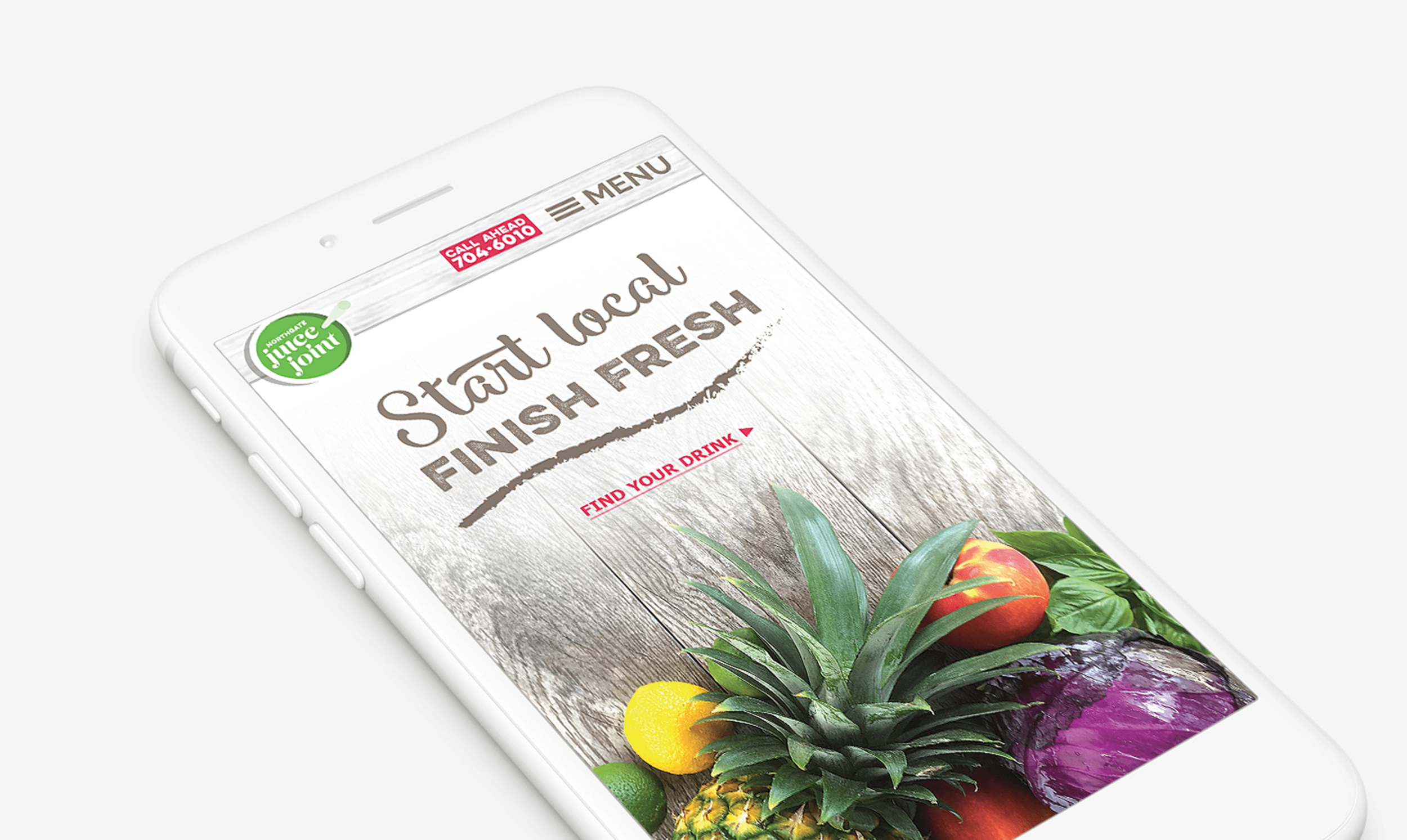
Northgate Juice Joint needed a visual identity and website that separated it from national smoothie chains. Without a budget for online ordering, the owner wanted the site to encourage customers to call ahead to skip the line, while keeping it easy to update the site content herself as menu items changed.
Approach
I handled the visual identity, UI/UX, and photography. The process included customer interviews, sketches, wireframing, and prototyping.
I handled the visual identity, UI/UX, photography, and project management—coordinating between customers, the owner, and the developer. The process included customer interviews, sketching, wireframing, and prototyping.
The site takes a mobile-first approach with flexible navigation: users toggle between list and grid views, then tab between product shots and nutritional details. Simple, functional, and built for students ordering on their phones.
The work gave a local juice bar a distinct look and a practical tool for running their business.
SCROLL to see all work in this section.
Creative Direction, Project Management, SEO, UX, Visual Design
RNL is growing fast but is a relatively new home builder to the Bryan/College Station area. This site is version three that my team has developed. A mobile-first approach, the site is flexible to grow as RNL adds more communities, floor plans, and content.
We have also created an ebook, print ads, indoor and outdoor signage, and vehicle wraps.
Credit:
DiAnne Olson - SEO, Writing
Patrick Heinrich - Web Development
Tools Used:
Illustrator, Photoshop, Sketch, Zeplin, InVision
SCROLL to see logos.
Scroll down to see all work in this section.
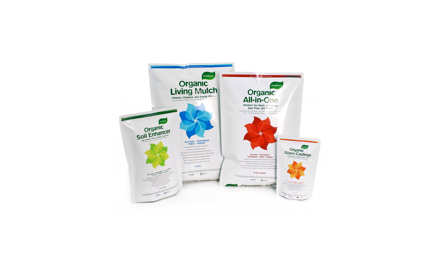
Package Design
From living mulch to worm castings, The EarthSweet brand was built from the ground up by the team at fosforus.
The leaf logo shape is used to create a floral graphic that is color-coded for each product. The result is a clean bright package design that stands out in a crowded marketplace. And yes, with a name like EarthSweet, the bags are biodegradable.
Agency: fosforus
Credit: Chris Maher, Eric Sutherland
Scroll down to see all work in this section.
Art Direction/Design
With this over-sized executive direct mailer, CAST, The Application Intelligence Company, is offering to deliver a complimentary CASTSCAN to assess the fault line in your most critical business application.
It’s far better to identify faults now rather than having to assess blame later.
Agency: fosforus
Credit: Chris Maher, Eric Sutherland, David McKnight